The Infinity Wallet Evolution
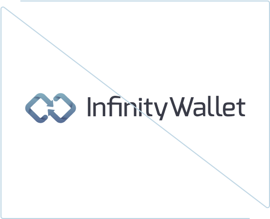
This brand kit is for use of the Infinity Wallet logo in conjunction with our trademark guidelines

1/5
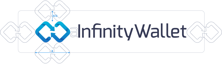
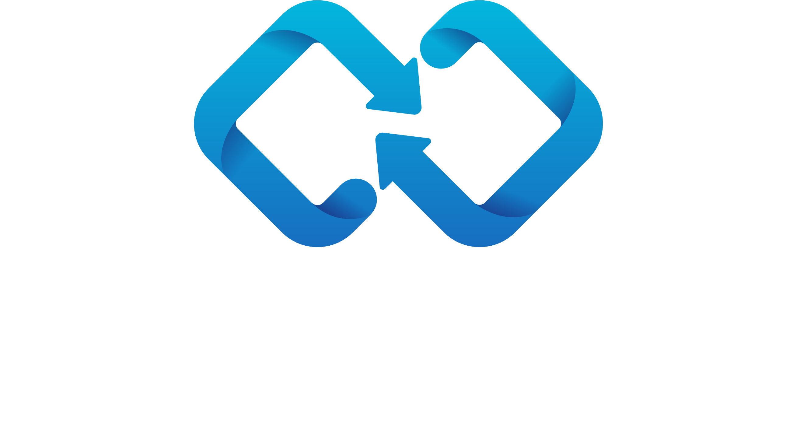
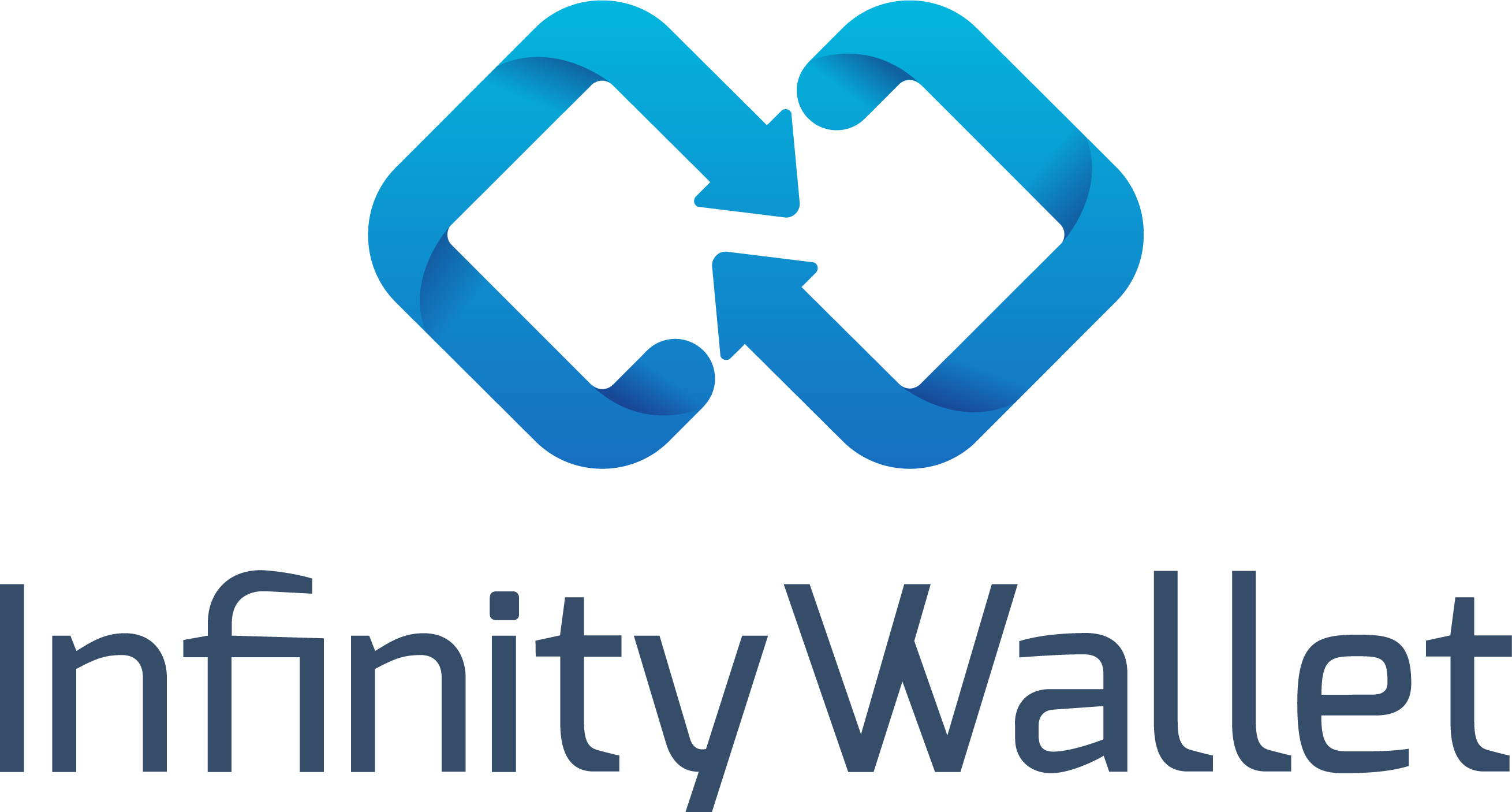
Infinity Symbol
The infinity symbol represents our core brand name and how we aim to provide users with everything, along with the unstoppable nature of blockchains.
2/5
Arrows
The arrows represent users' wallet transactions - sending, receiving, and swapping.
3/5
Block Square
The blocks represent the blockchains and the immutable, decentralized and censorship-resistant nature of the blockchain.
4/5
Letter W
The letter W represents our primary functionality as a wallet, with our goal to be the leading all-in-one crypto platform.
5/5
Number 3
The number 3 on its side represents our focus on enhancing Web3 and the decentralized world for all types of users.
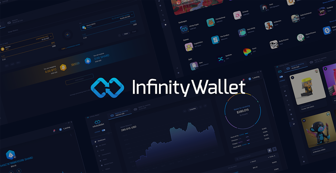
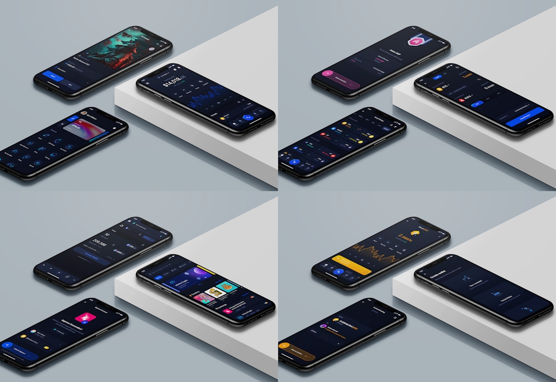
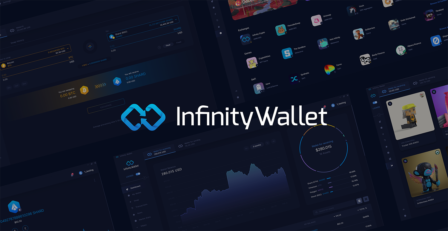
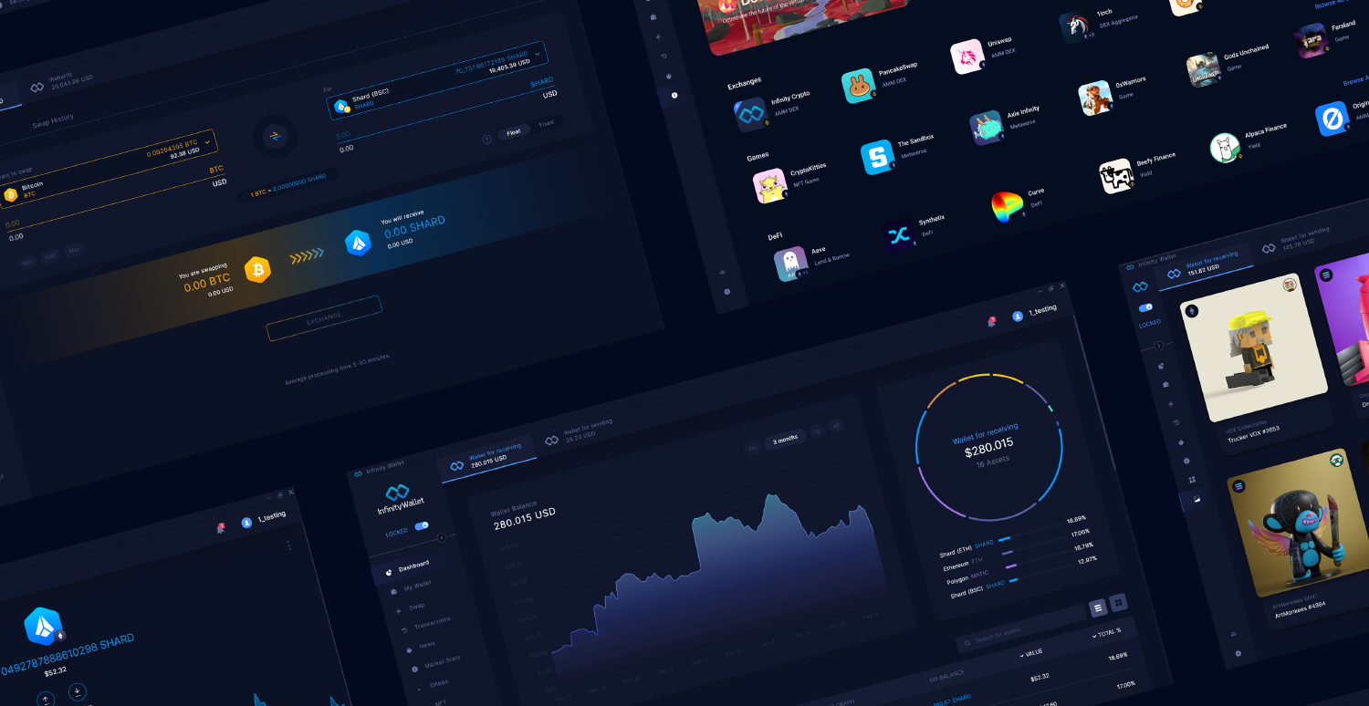
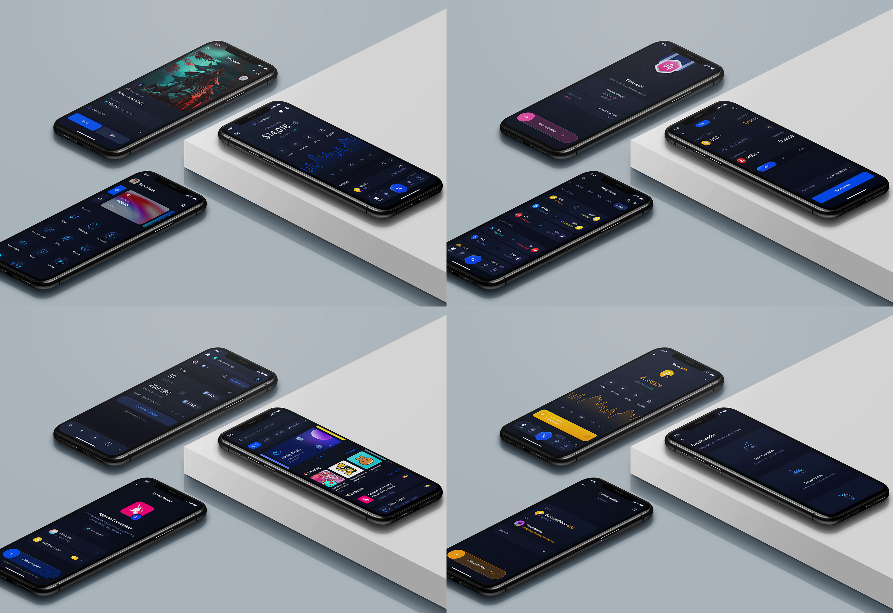
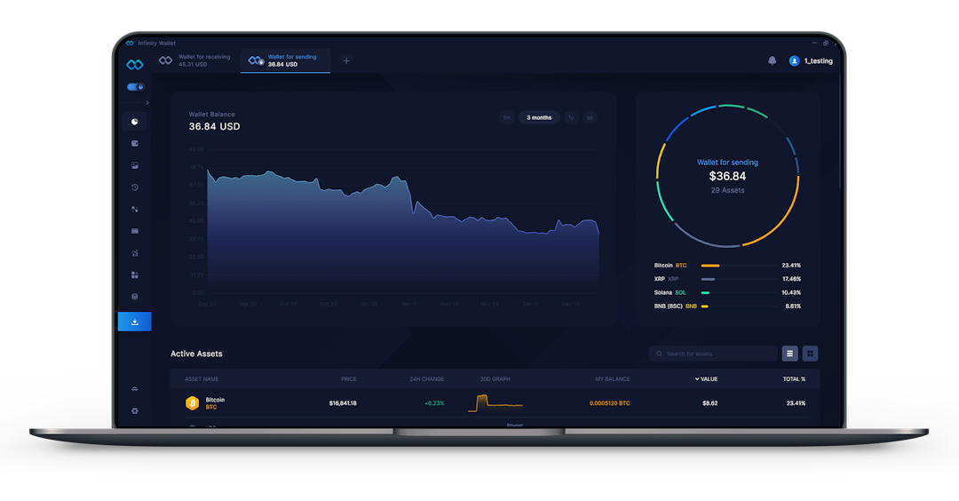
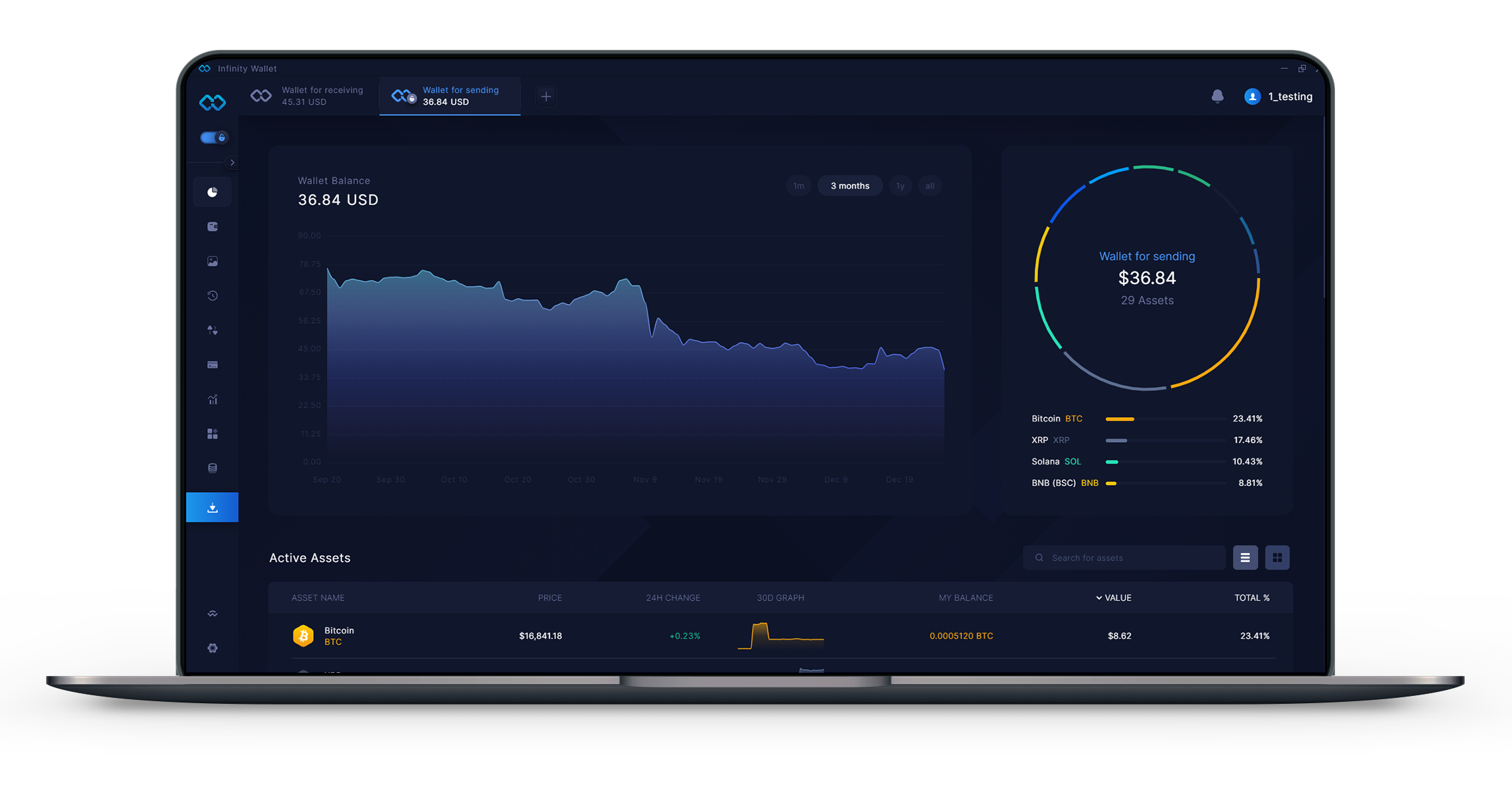
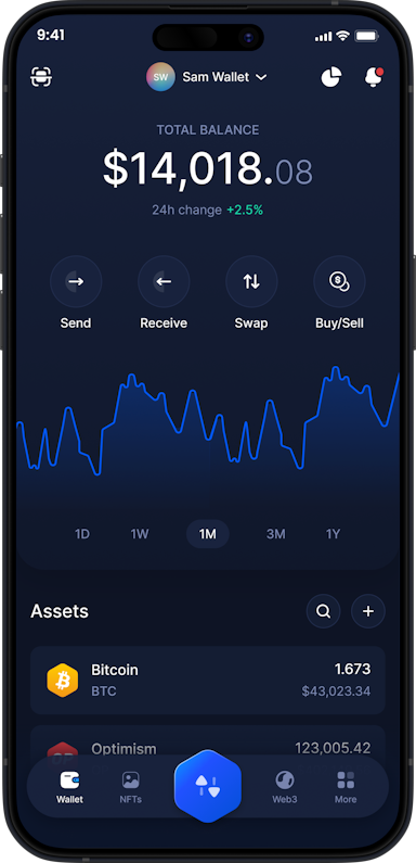
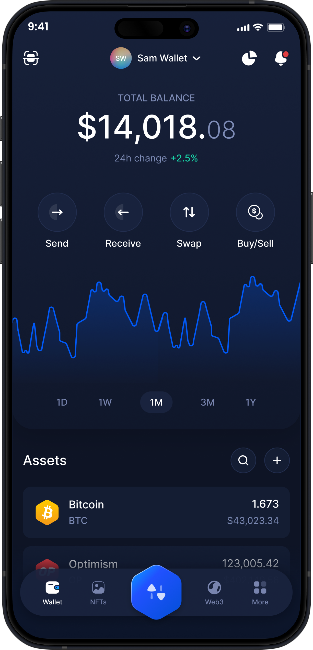
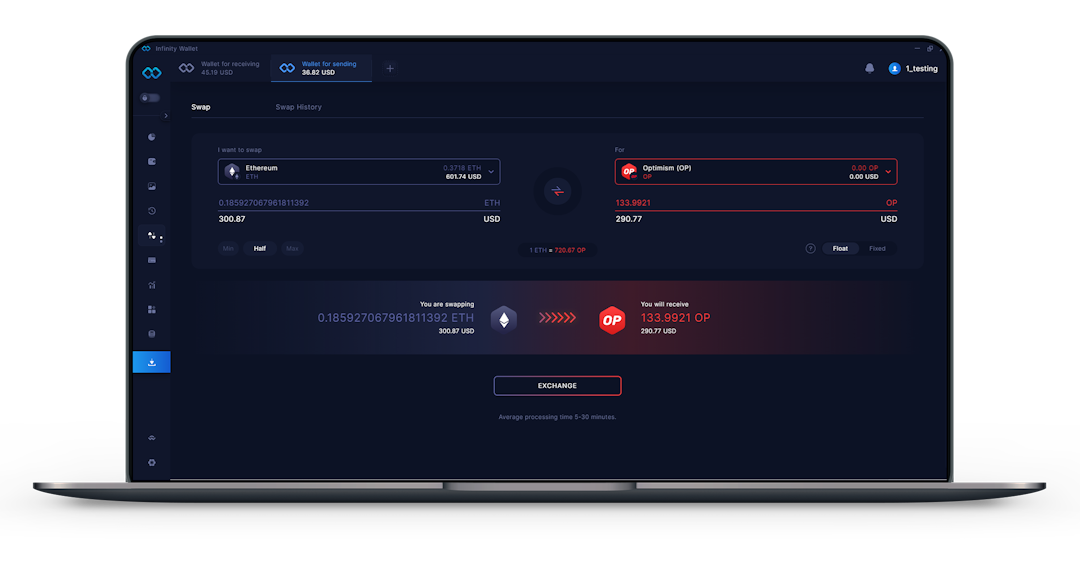
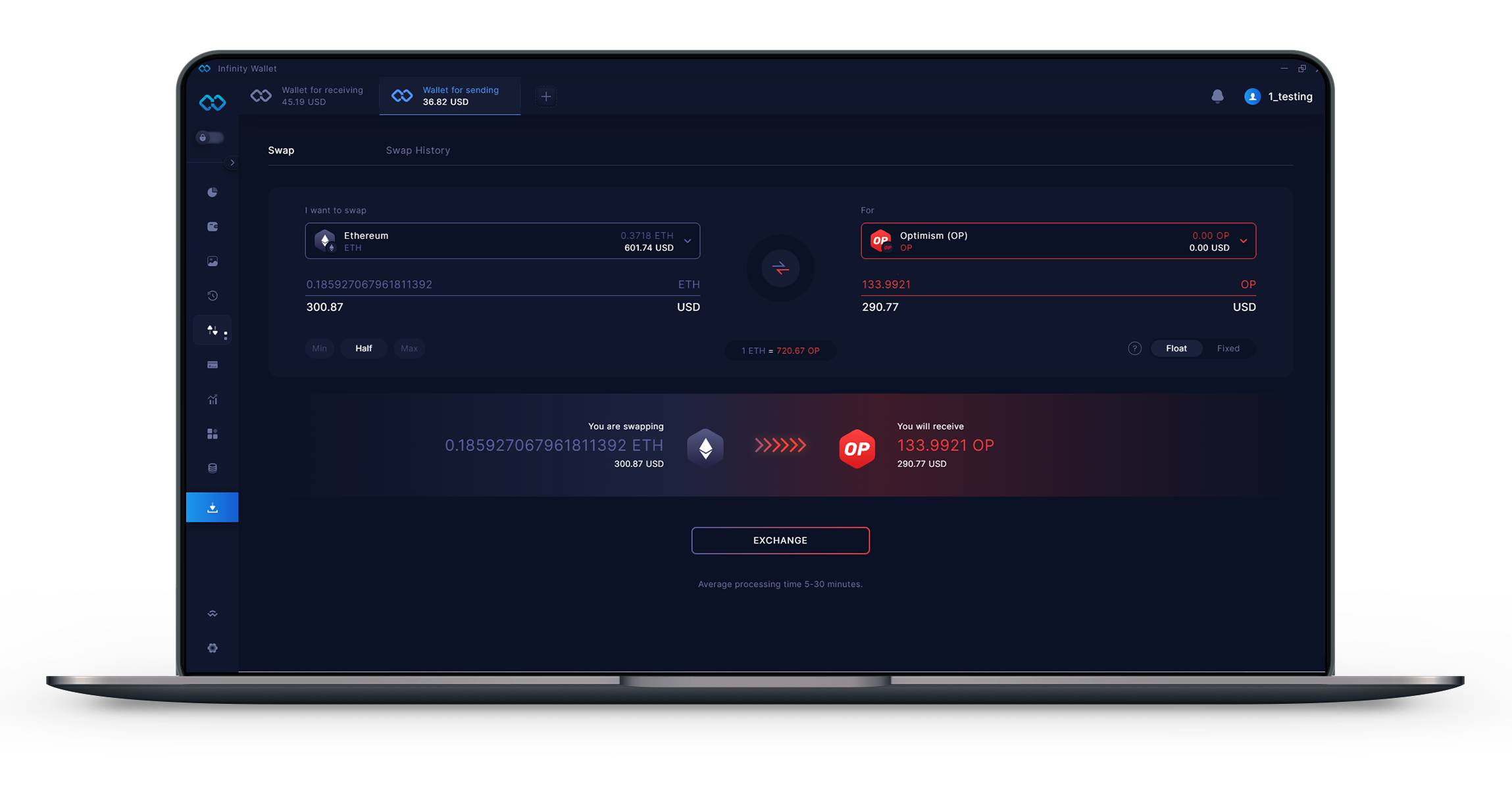
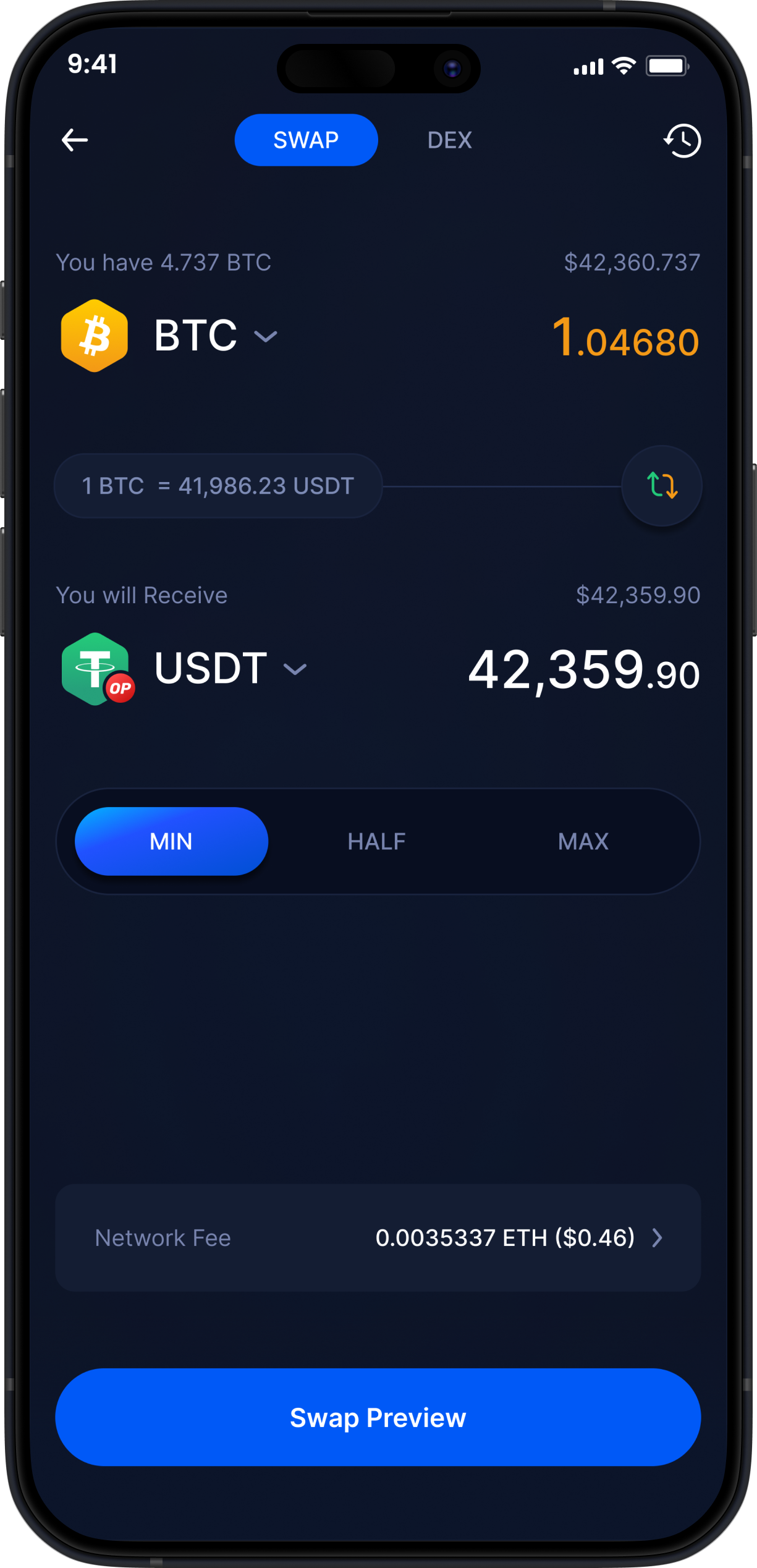
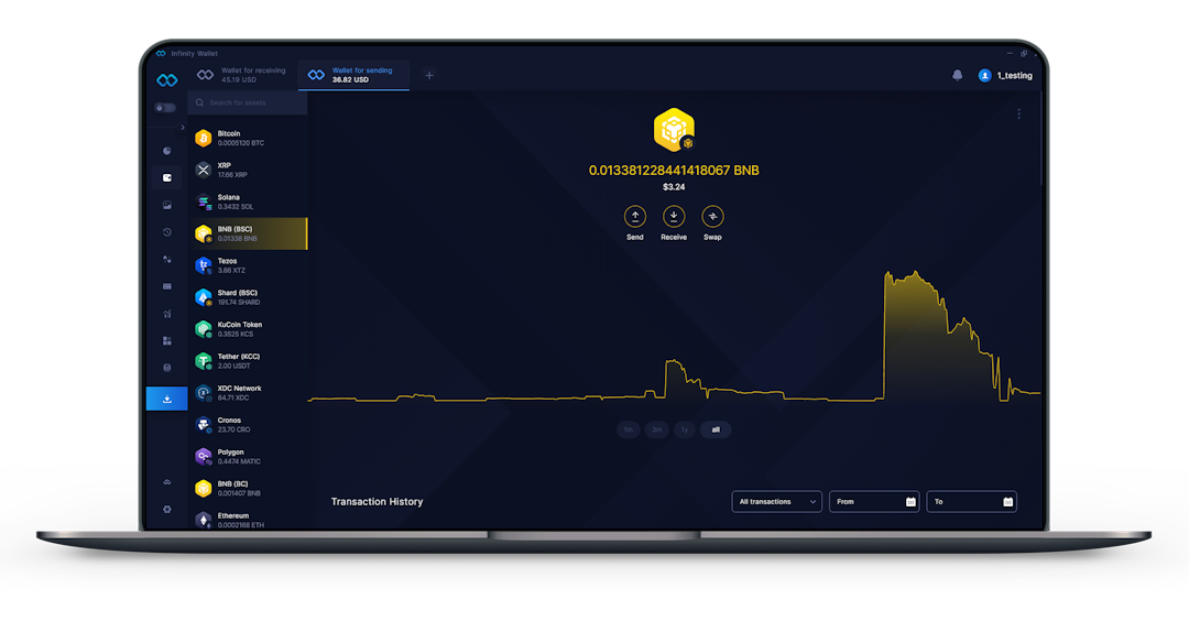
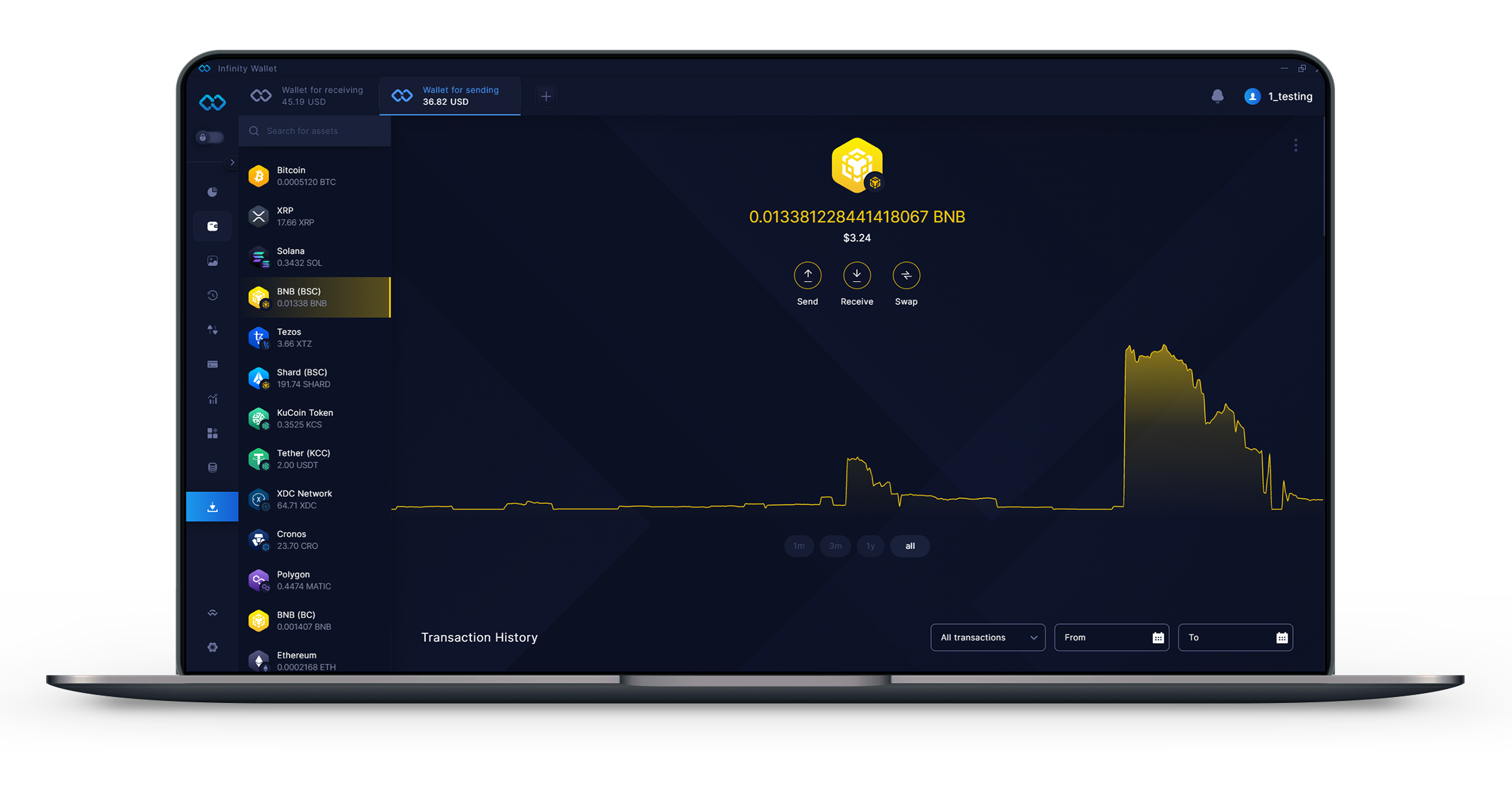
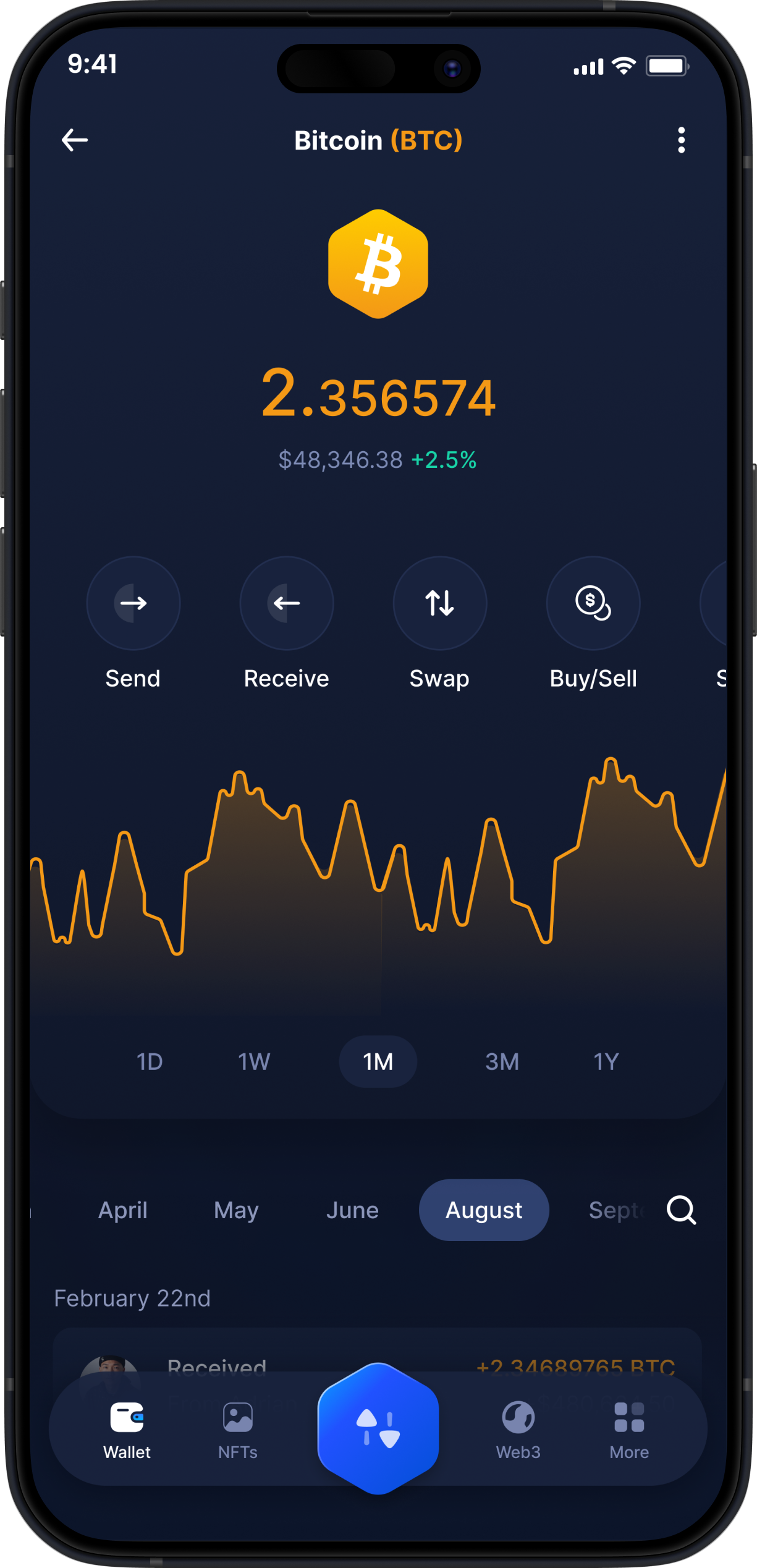
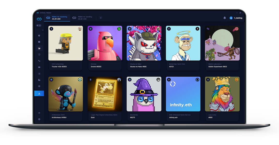
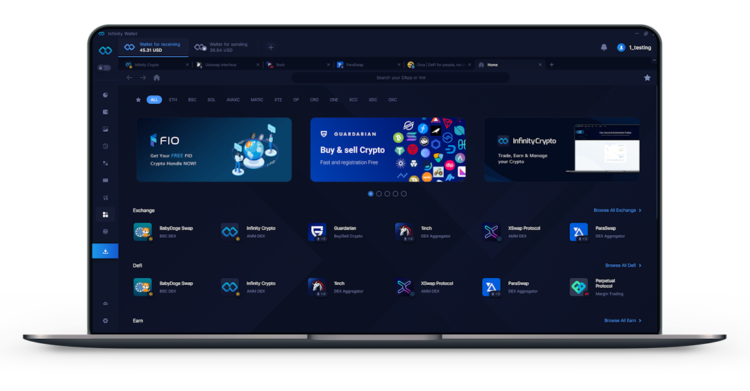
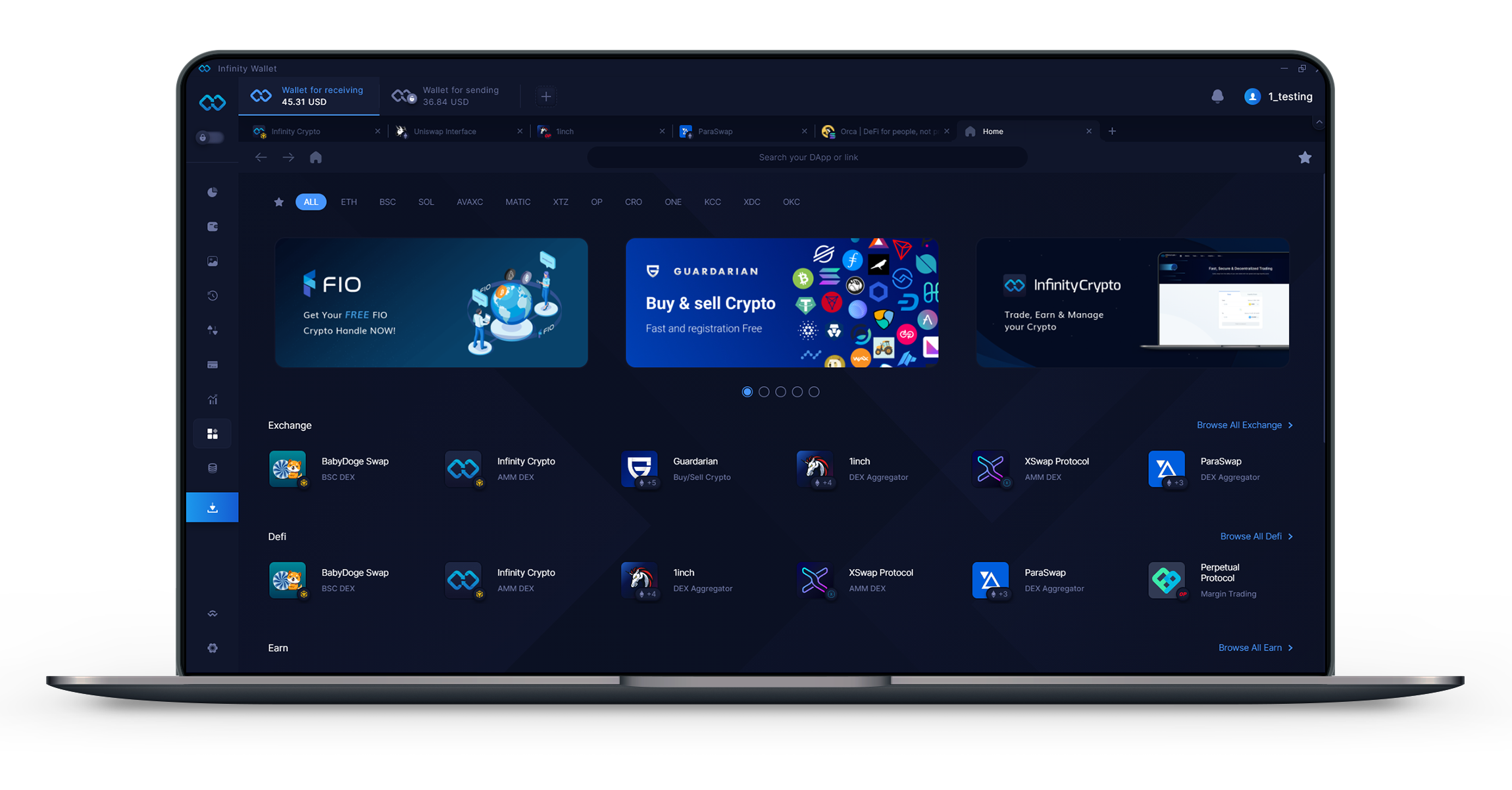
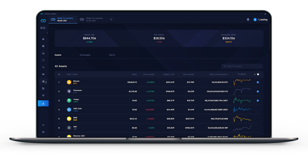
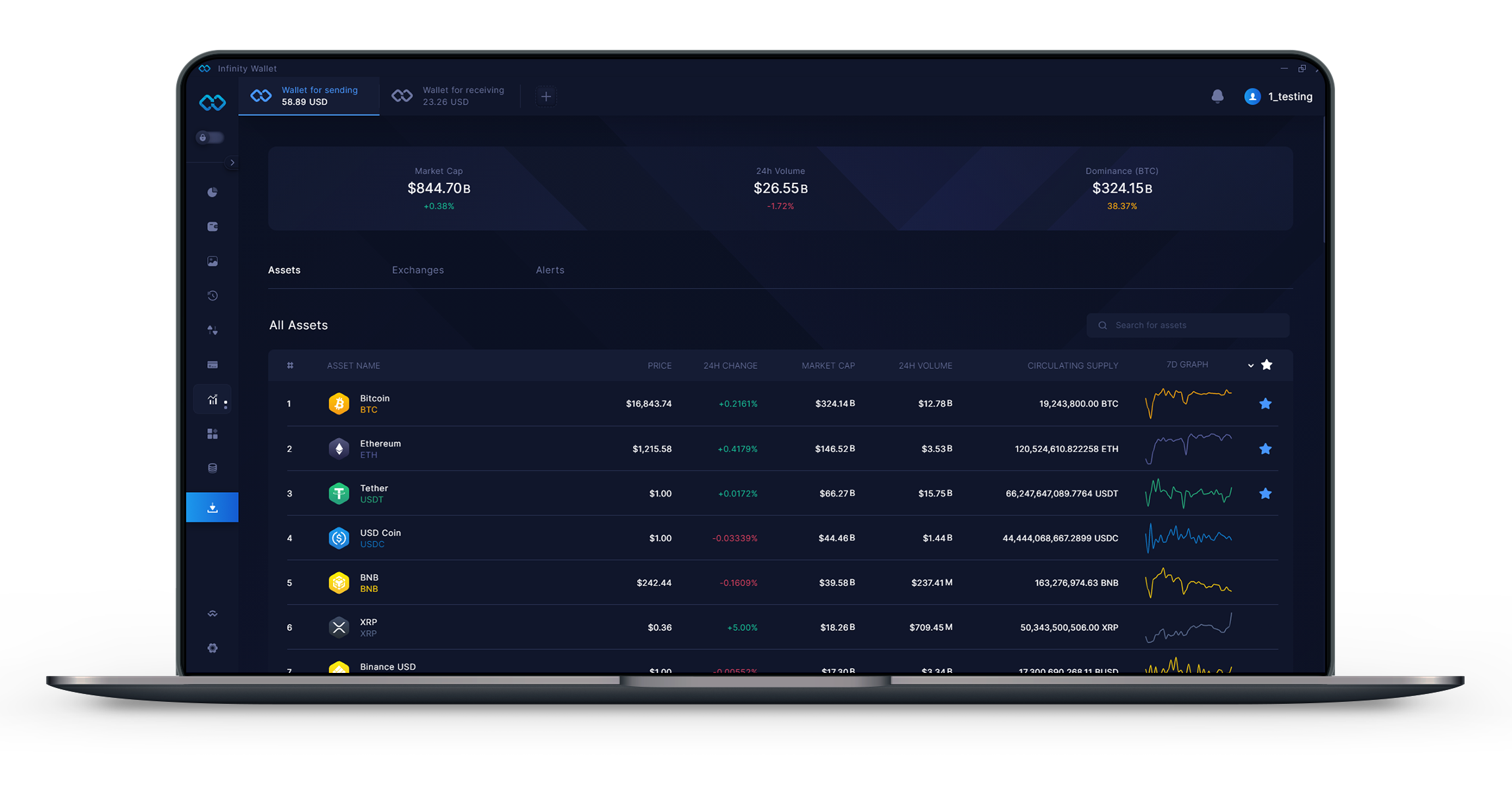
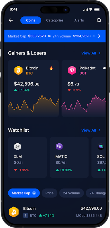
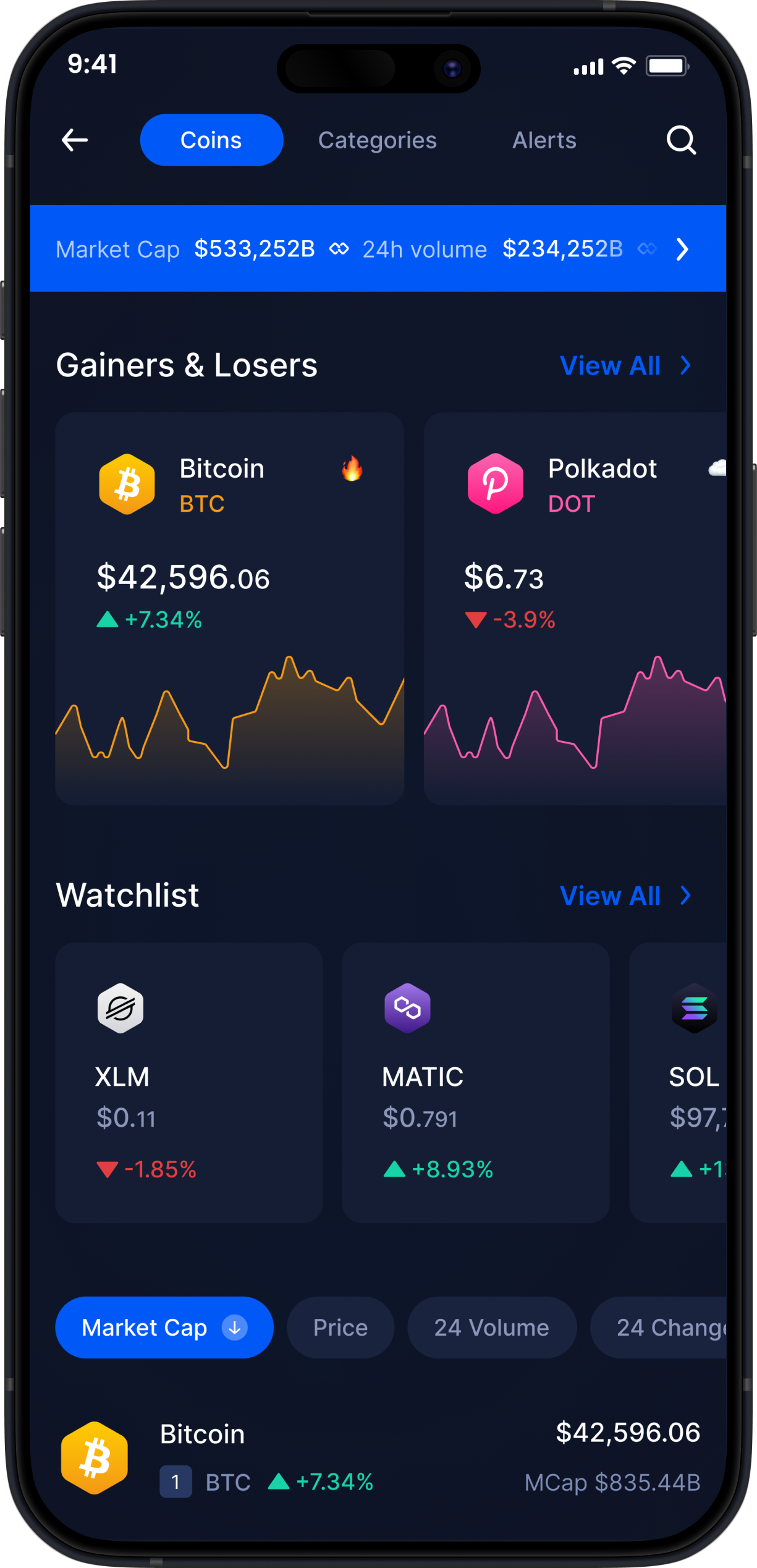
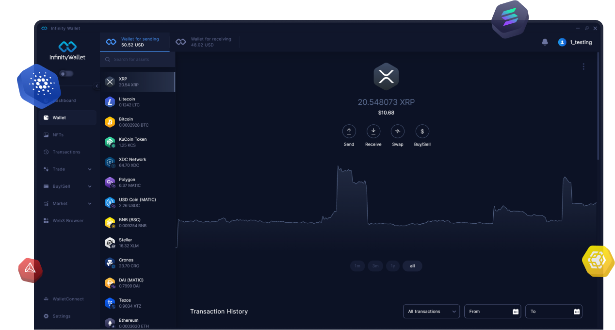
Our Media Assets
Use the following logo, icons, colors, banners and high resolution screens


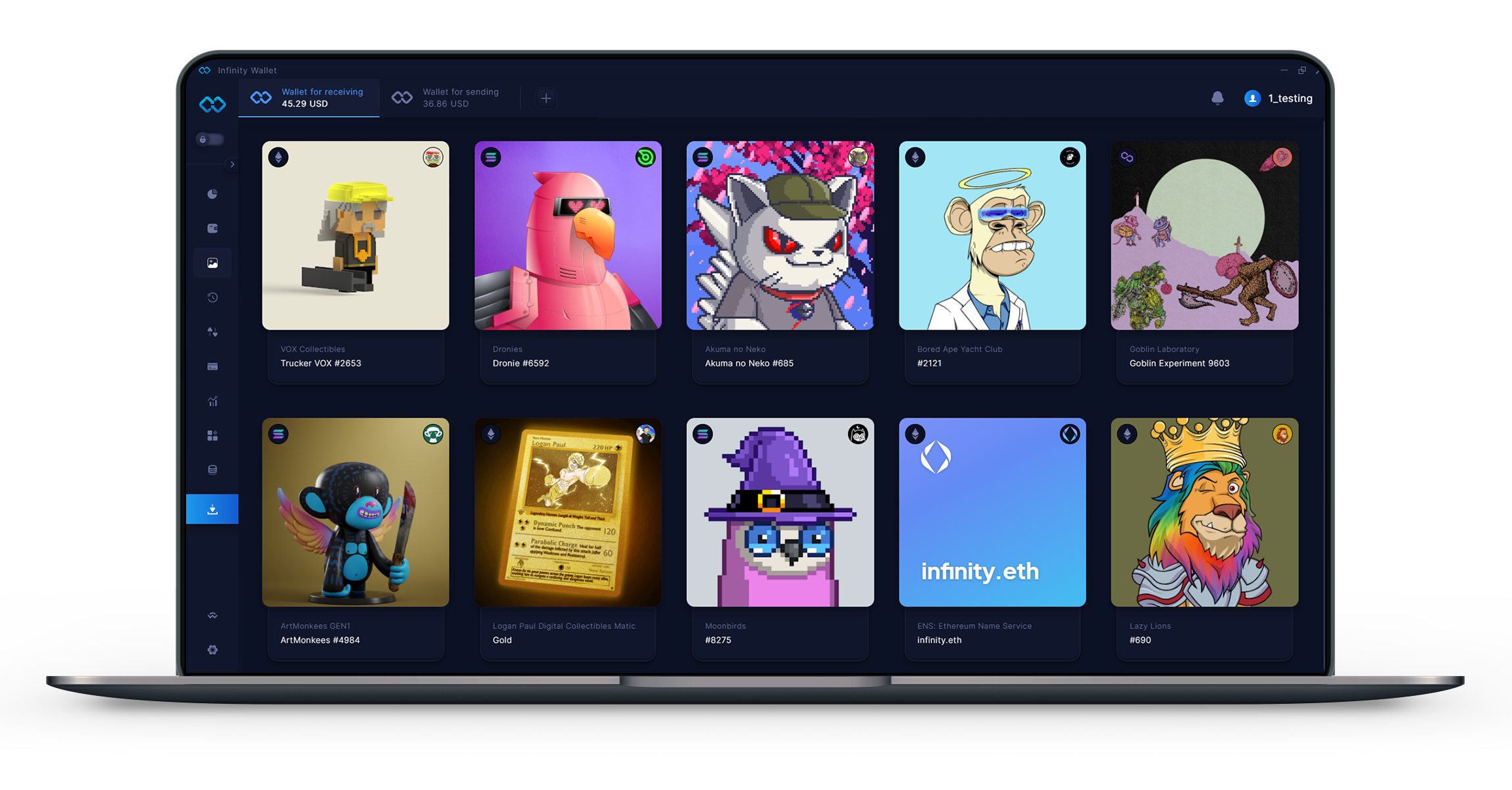
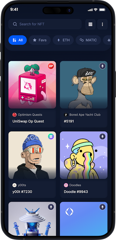
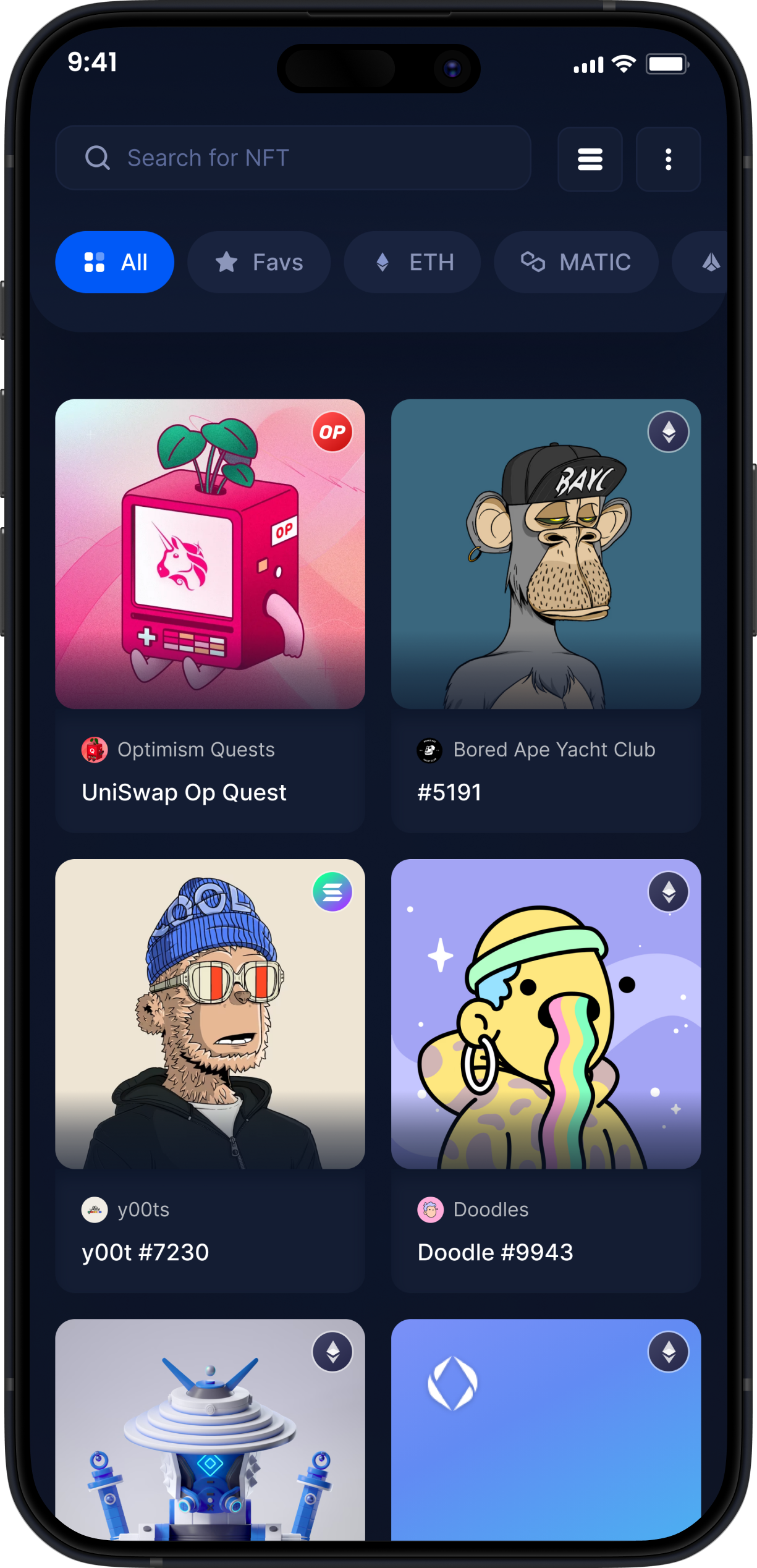
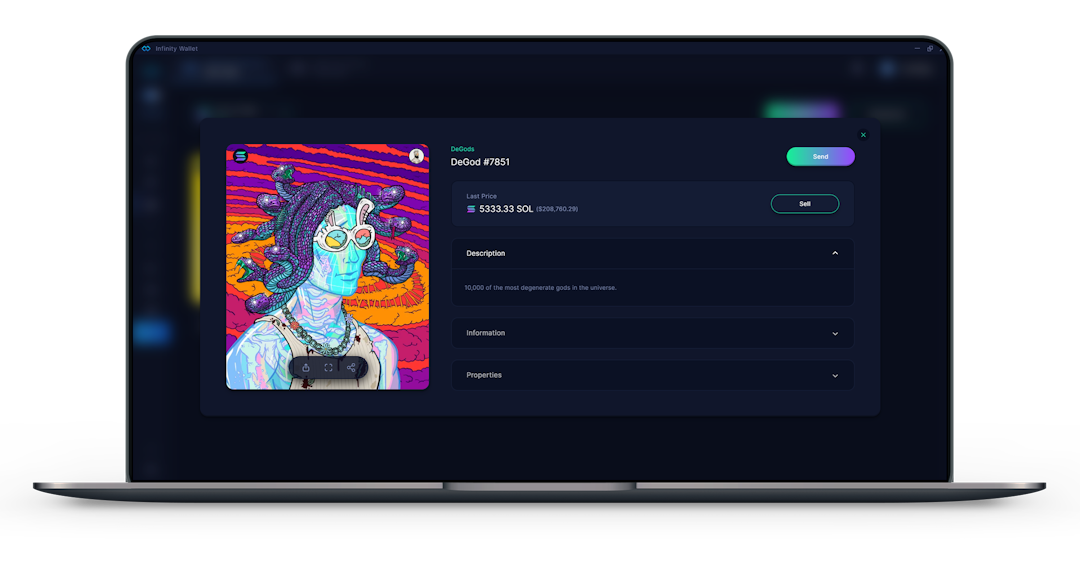
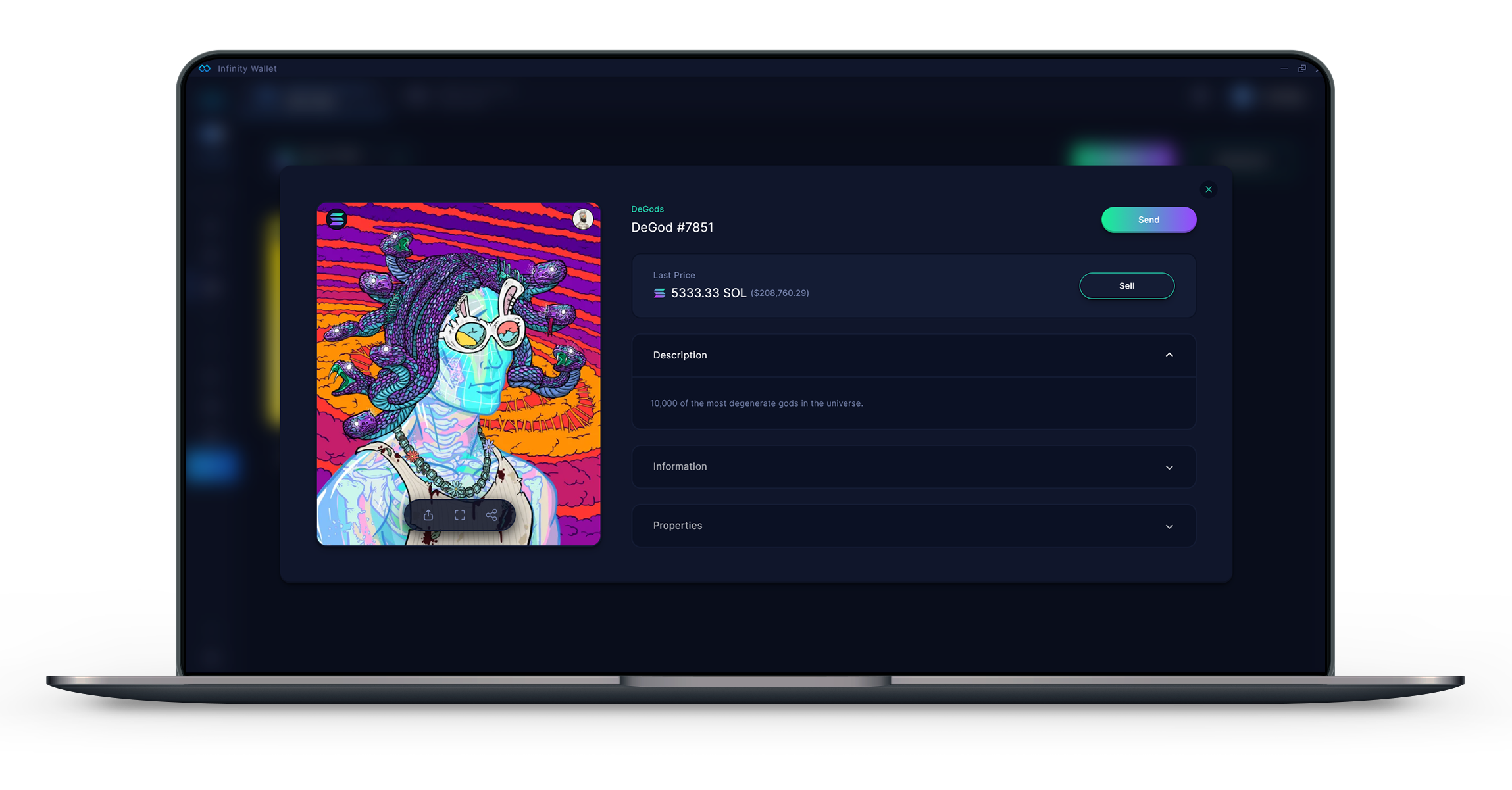
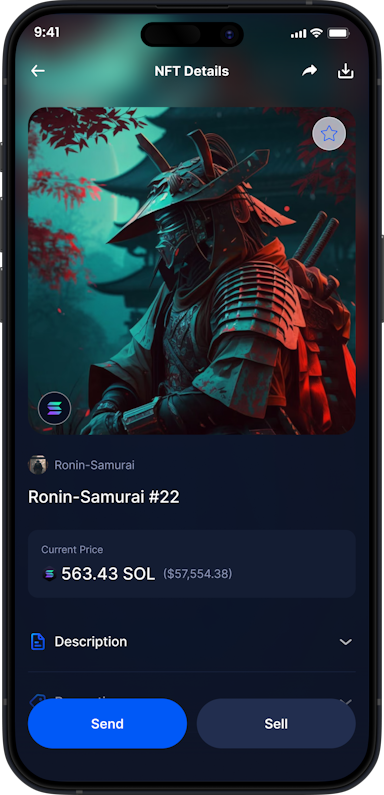
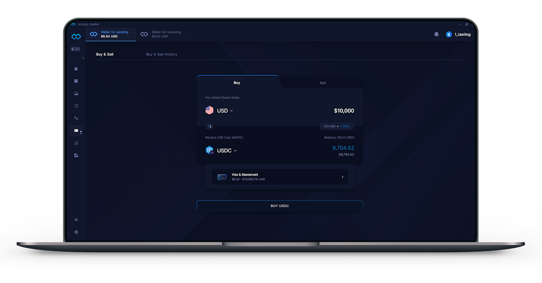
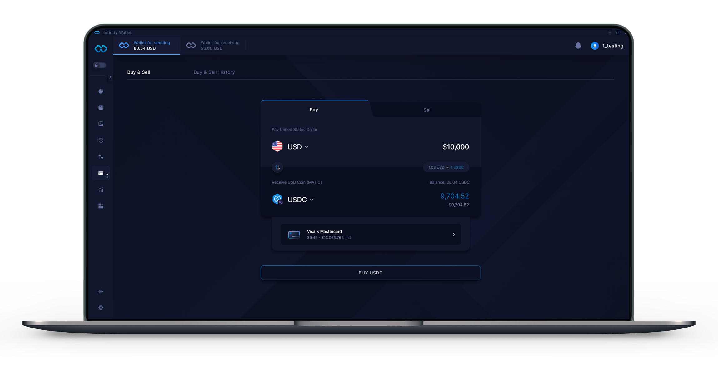
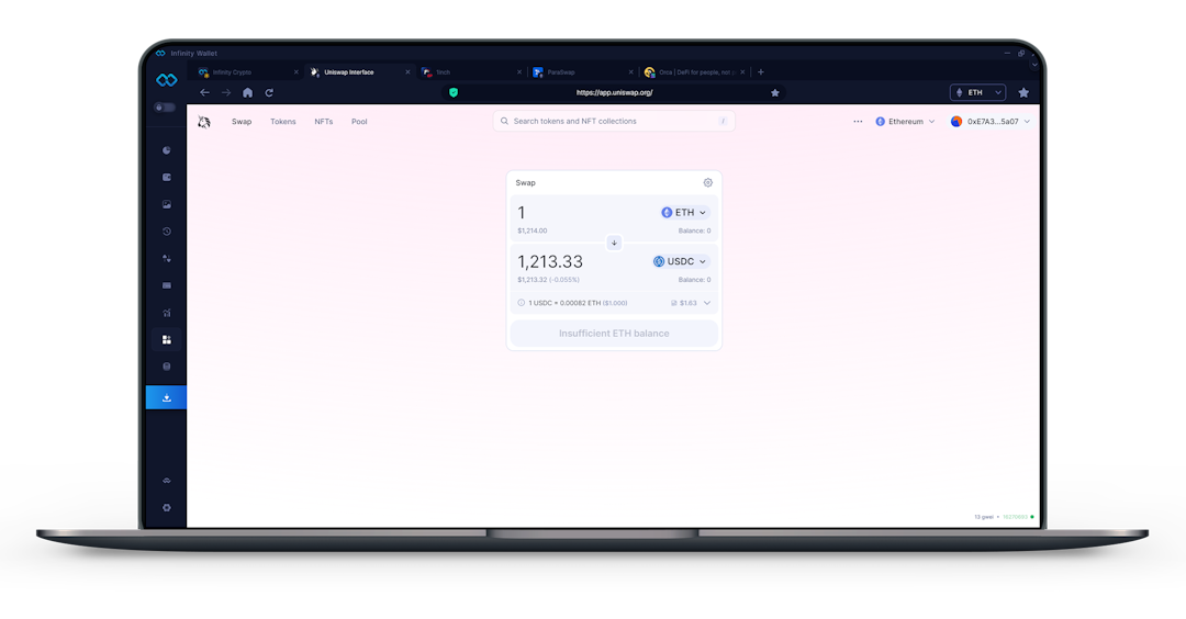
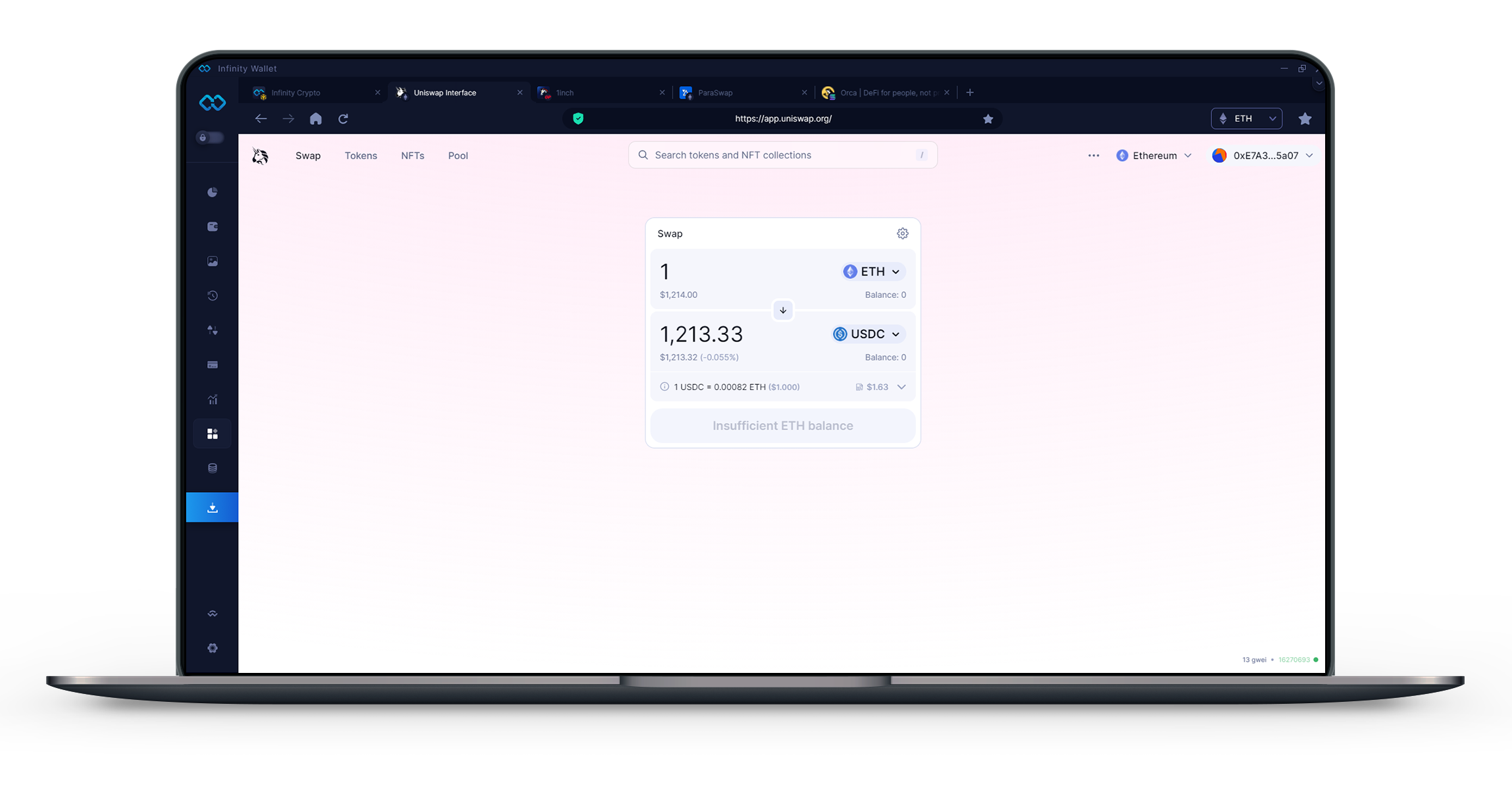
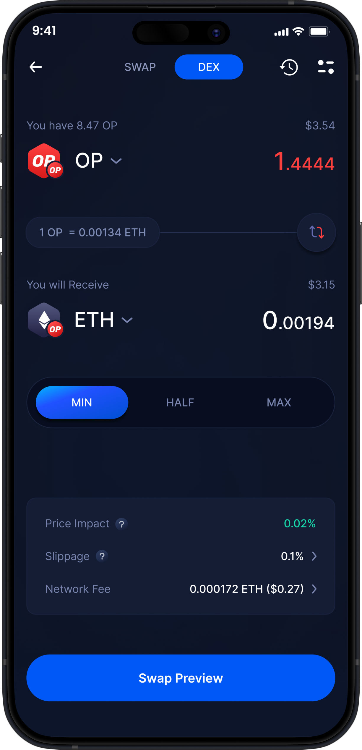
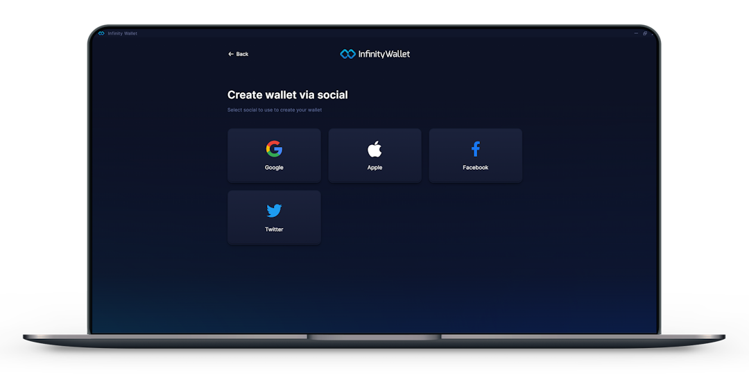
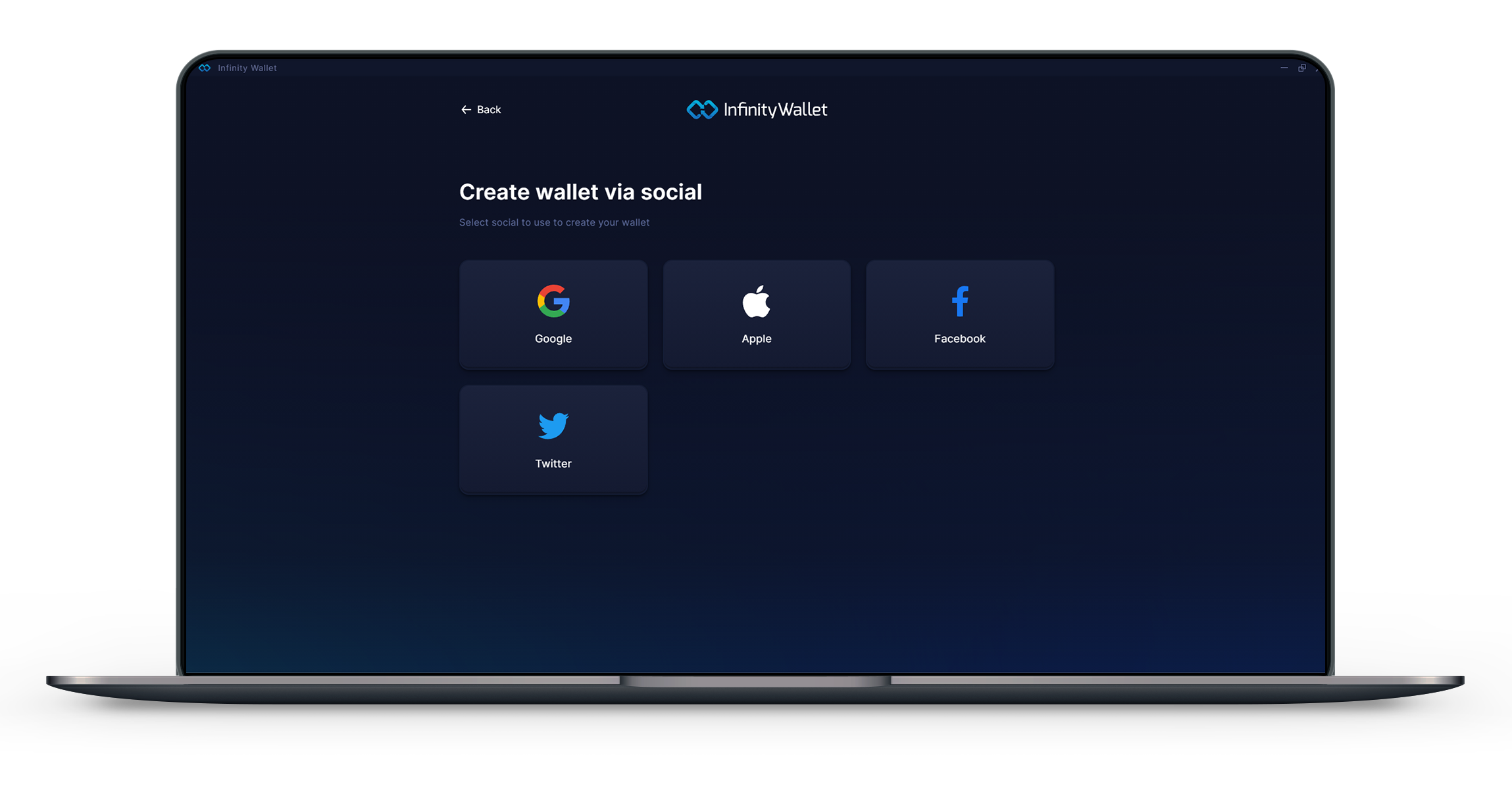
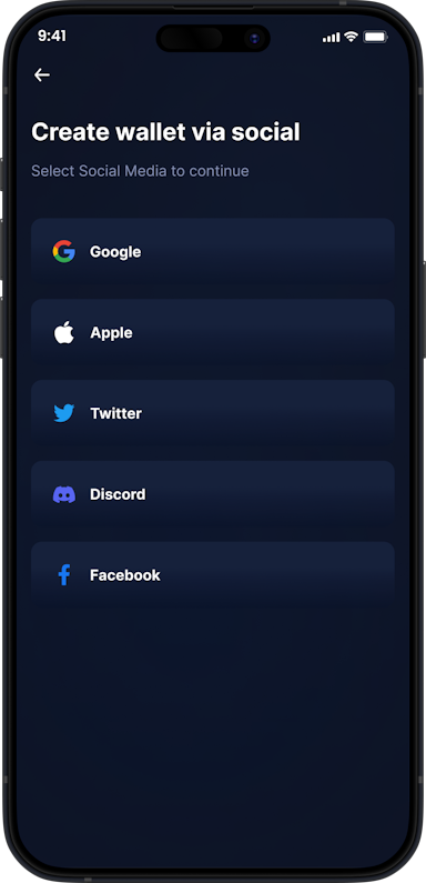
We strive to provide an easy and intuitive blockchain experience for all users

Our Brand Usage
When using the Infinity Wallet logo you should not edit, change, distort, recolor, or reconfigure it in any way